
01—process behind the form follows function typeface
Welcome to our very first article, where we would like to share the process behind creating our custom typeface and show some details about it as well. We believe you might find this article interesting if you want to learn more about us, our product, or typography.
Note: this article contains typographic terms.
THE IDEA
It all started with the idea of creating a T-shirt with a simple message that means something to us, basically, a message that reflects our philosophy and connects us with people who understand its meaning. So, form follows function was born, and if you are reading this, maybe you’re already familiar with this design principle.
We had our message written in San Francisco’s sans-serif typeface in the Notes app. It looked elegant and calm, but the message needed to be printed on a T-shirt, so the question was, which typeface to pick? There were some criteria, for example, to be original, elegant, and, finally, legally correct. There are loads of great options out there, but for me, as a designer interested in typography, it was clear not to choose any already existing typeface but to create a new one instead, at least part of it.
CHARACTERISTICS OF THE TYPEFACE
My background in product design and architecture, where everything should be in exact dimensions, heavily influenced me. Also, I wasn’t as abstract as other people during my fine art school. I always prefer to find logic, order, and geometry, and I like combining these worlds.
Our typeface is based on geometric shapes and parallel lines with simple, smooth curves. The characters share some elements as needed but also vary in some to reveal individuality and difference. In other words, they speak the same language, but every character has a slightly different tone. Of course, it is heavily inspired by Helvetica Neue and Apple’s San Francisco, but we needed to make it fast, neutral, and timeless; who wants to wear something temporarily stylish that would be out of style next year?
—screenshot of the page from the form follows function T-shirt manufacture guidelines
THE PROCESS
The drawing process started with one horizontal line, where all characters were supposed to sit, called baseline. Then I draw my cap and x-heights. These two lines dictate the height of the characters. Thus, I was able to define the basic structure through simple geometric lines to find the right way to compose individual characters.
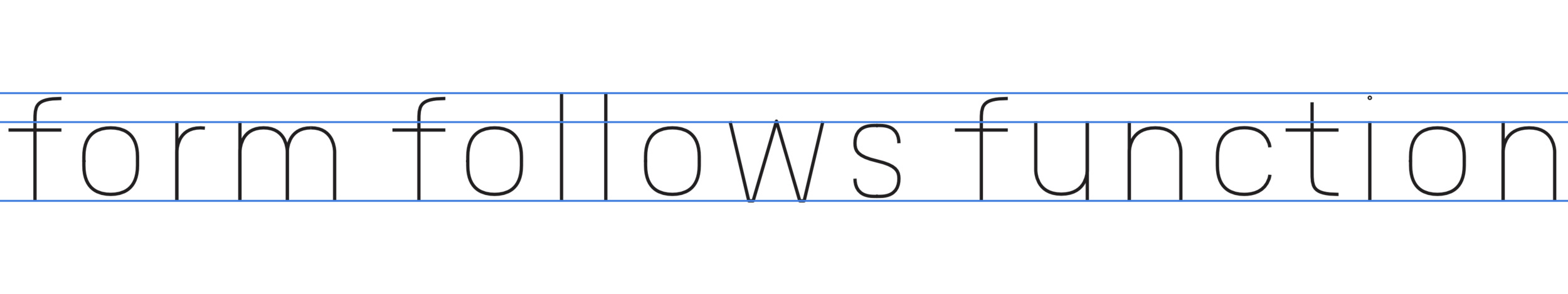
Following the structure, I created outline strokes to add thickness and mass, simplify the nodes in the geometry on every character to minimum to achieve smooth and true geometry based curves.

Then I was able to adjust the baseline, x-height, and cap-height for all characters. This means that characters need to be optically aligned to look alike next to each other; so, for example, the rounded characters need to be slightly bigger to compensate and overhang both baseline and x-height. We went for a more subtle difference.

As I mentioned in the characteristics of the typeface, the characters share or follow some elements. For example, the arm of r continues with curves of the tail of character y. With every new character, I was thinking about which part of the other character I could borrow because I really wanted to have this kind of connection. It always makes the characters more consistent.

After I created all the characters we needed, I carefully aligned proportional tracking, kerning, and word spacing for use with different sizes; thus, I made more loose tracking for small sizes, more open for big screen use on presentation materials, website, etc. Here is the difference side by side:
Below are some screenshots of creating the typeface. It was a lot of planning and many concepts behind the right shape:
CHALLENGES
The typeface was designed with legibility in mind and, actually, legibility was very important since I’ve known that the printed message on our T-shirt should not be dominant, but rather elegant, silent, and nicely readable from a distance, which was quite difficult because fabric tends to have bumpy texture and screen print could bleed little details, especially in smaller sizes when your height from baseline to cap-height is small. After some print tests, I created a special, optimized-like version of a typeface with some ink traps.

—blue parts were shaved from the characters; the result after screen print was better
RÉSUMÉ
We hope you enjoyed this process—this is how everything came together.
Later note: At the time of writing this article and making these letters for our T-shirt, I was not experienced enough in type design, so this typeface was never finished due to many mistakes in the design process; however, the printed version was good enough, and it helps us produce something wonderful that started bremay.
Thank you for reading all of this, we really appreciate it.